Menu

Color psychology: How color affects people’s feelings and behaviors?

As a graphic designer, I had to learn that colors have a crucial influence on people and their emotions. Knowing the basics of color psychology is super important in the graphic design sector because the visual impact of a brand affects people’s emotions and behaviors. Apart from that, I consider creating color palettes and choosing colors for my projects to be the most fun and exciting part of my job 🙂

Here is a simple guide that provides information about colors and their impact on the success of your design. Think about the audience you want to target. Then, choose the specific colors you’d like to use in your project to make it more attractive to your viewers. How do you want to make them feel?

Neutrals

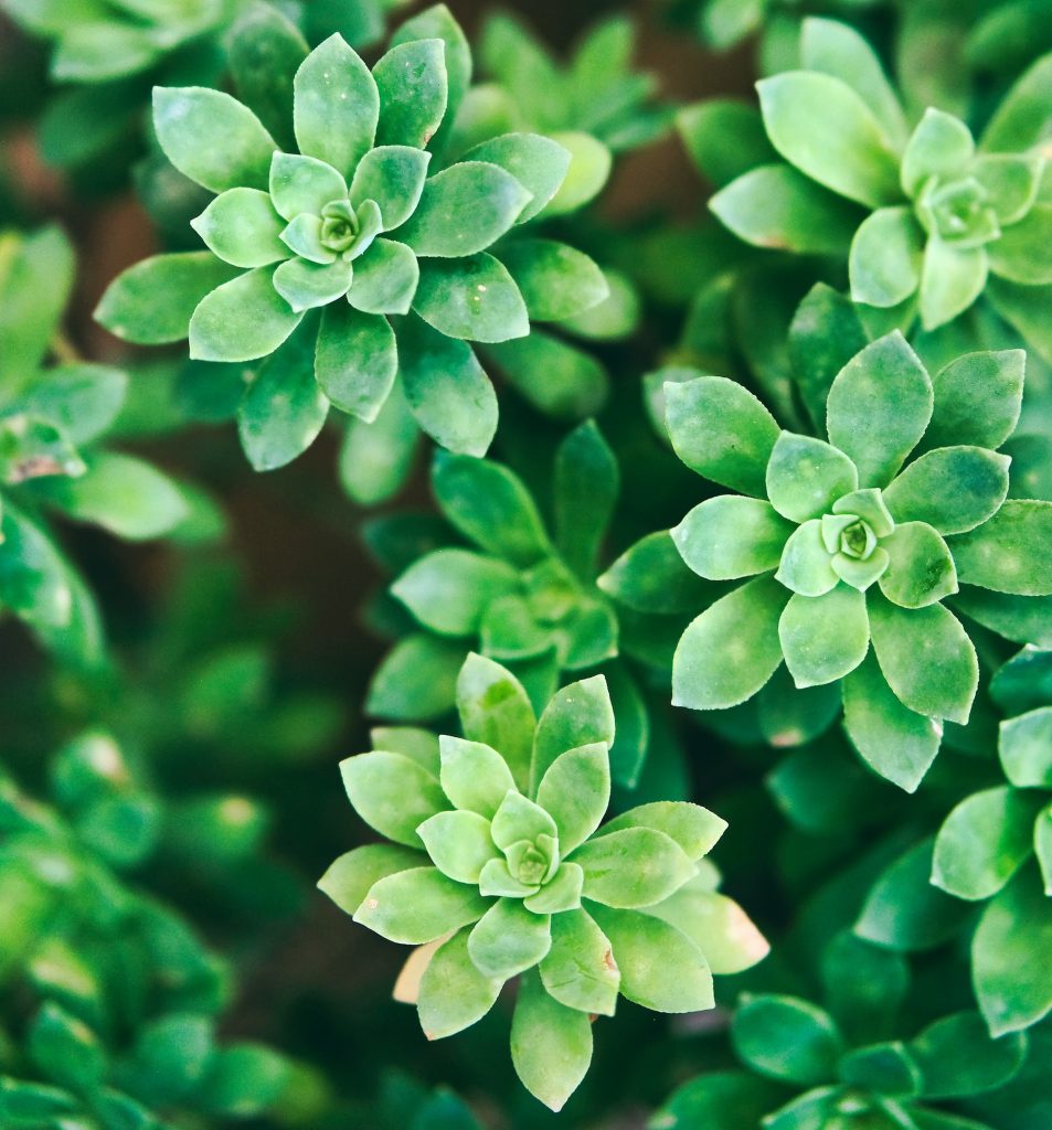
Neutrals – unsaturated with color. Those include: white, beige, brown, grey, and black. They are a crucial component of a successful design because they’re visually restful and you can freely mix them with any color palette!

White – encouraging purification

  • innocence,
  • purity,
  • cleanliness,
  • light,
  • brilliance,
  • perfection,
  • safety,
  • illumination,
  • understanding
  • faith,
  • novelty,
  • spirituality,
  • possibility,
  • protection,
  • softness.

Black – restful color

  • authority,
  • power,
  • elegance,
  • respect,
  • formality,
  • fear,
  • grief,
  • death.

Brown – the color of earth and wood

  • reliability,
  • elegance,
  • simplicity,
  • honesty,
  • security,
  • stability,
  • warmth,
  • health,
  • stimulates the appetite.

Grey – neutral feelings

  • durability,
  • balance,
  • smoothness,
  • sophistication,
  • loss/depression.

Cool

In general, cool colors are used for creating a highly professional look of the brand. They evoke feelings such as relaxation, calm, and trust.

Blue – most popular logo color

  • trust,
  • importance/significance,
  • calmness,
  • relaxation,
  • peace,
  • stillness,
  • confidence,
  • tranquility,
  • motivation/productivity,
  • sadness.

Green – strong correlation with nature

  • health,
  • vitality,
  • serenity,
  • calmness,
  • relaxation,
  • ecology,
  • money,
  • luck.

Purple – the color of kings

  • royalty,
  • wealth,
  • mystery,
  • luxury,
  • nobility,
  • ambition,
  • magic,
  • spirituality,

Pink – feminine color

  • love,
  • romance,
  • youth,
  • spontaneity,
  • fun,
  • softness,
  • compassion.

Warm

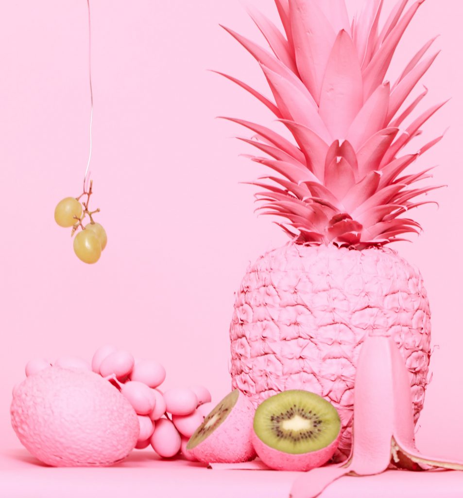
Warm colors attract attention, so they’re often used in the advertising and marketing fields. They provoke really strong feelings and can be overwhelming for the viewer’s eye.

Red – inspires action

  • passion,
  • desire/lust,
  • intense love,
  • high energy,
  • power,
  • courage,
  • warmth,
  • attention,
  • danger,
  • anger/aggression.

Yellow – happy color

  • energy,
  • happiness,
  • joy,
  • excitement,
  • focus,
  • danger.

Orange – pure energy

  • joy,
  • energy,
  • excitement,
  • creativity,
  • warmth,
  • refreshment,
  • gives the sensation of heat,
  • stimulates the appetite.

As you can see, color selection is a crucial part (or even the most important part) of the design process. Choose the color palettes wisely! 🙂

Love, M.

Related posts

Zodiac star sign prints: Decorate your walls with your zodiac sign printable poster!
Astrology: Zodiac Signs Art: dates, constellations, facts, and more! (+ digital illustration for each zodiac sign)
How to get things done with an undated digital planner based on David Allen’s time management system
0 0 vote
Article Rating
Subscribe
Notify of
guest
0 Comments
Inline Feedbacks
View all comments
Search
0
Would love your thoughts, please comment.x
()
x